

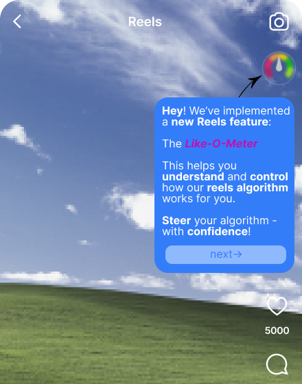
Like-O-Meter
Speculative design and user research toward transparent, controllable AI recommendations on Instagram Reels — including focus groups, thematic analysis, SUS evaluation, and iterated high-fidelity prototyping.
Overview
Instagram Reels serves content through an opaque AI recommendation system that analyses hundreds of implicit signals — watch time, replays, shares, long-term engagement patterns — to decide what you see next. Users have almost no visibility into this process and little meaningful control over it.
Like-O-Meter is a speculative design project that asks: what would it look like if Instagram actually showed you what it was inferring about you, in real time? And would transparency alone be enough to give users genuine agency?
The project combined a rigorous literature review, structured focus groups, co-design sessions, System Usability Scale (SUS) evaluation, and high-fidelity Figma prototyping to produce a speculative redesign of the Reels interface. It was written up as a co-authored academic paper — From Opaque Algorithms to User Control: A Critical Review of Instagram Reels Recommendation Experience to Inform Prototype Design — submitted as part of the MSc HCI programme at Newcastle University, 2026.
The problem
AI recommendation systems are among the most consequential interfaces most people use daily — shaping attention, mood, and behaviour at scale. Yet from a design perspective, they are almost entirely one-directional: the algorithm infers, the user consumes.
Instagram's own transparency documentation describes the signals the Reels Chaining system uses, but this information is buried in support articles almost no user reads. The interface offers no reflection of what the algorithm has learned about you, no explanation of why you're seeing a particular reel, and no meaningful way to correct its inferences.
From an interaction design perspective, Instagram integrates mechanisms that maximise engagement while limiting understanding and control. Gesture-based vertical scrolling, autoplay, and infinite scroll create continuous content loops that prioritise efficiency over reflection. Recommendation refinement relies heavily on implicit signals — watch duration, scrolling speed, interaction patterns — whose weighting remains entirely opaque.
Previous literature consistently highlights two failures in this space:
- Transparency without agency is performative. Telling users "here's why you're seeing this" without giving them tools to act on that information doesn't improve the experience — it can actually increase frustration (Harambam et al., 2019).
- Interaction design asymmetry. Interfaces are heavily optimised for passive consumption and positive engagement signals, while corrective signals are buried and rarely used (Eslami et al., 2015).
Our research question: can a redesigned interface surface algorithmic inferences in a way that is genuinely legible, minimises cognitive load, and gives users consequential control?
Research & literature review
We began with a structured literature review across three bodies of work:
Human-AI Interaction (HAII) — examining how users form mental models of algorithmic systems, and what design patterns support accurate calibration of trust and understanding. Amershi et al.'s (2019) Guidelines for Human-AI Interaction were a central reference point throughout.
Explainable AI (XAI) — surveying existing approaches to algorithmic transparency in consumer interfaces. Most existing implementations are retrospective and decorative rather than real-time and actionable. Tintarev and Masthoff (2015) argue that presenting recommendations without explanation reduces user trust; later work confirms that improved transparency enhances both satisfaction and understanding.
Attention economics and digital wellbeing — drawing on research into how recommendation systems affect decision-making and self-perception, and what users say they want versus what engagement metrics reward.
A key insight from the literature: users consistently say they want more transparency and control in surveys, but rarely engage with transparency features when they're available. This suggested the design challenge was not just about what information to surface, but how to surface it without adding cognitive load.
Study design and two-prototype approach
Rather than designing a single intervention, we developed two complementary prototypes targeting different dimensions of the problem:
| Prototype | Dimension | Approach |
|---|---|---|
| Like-O-Meter | Explainability | Visible real-time inference display + manual score correction |
| Swipe Feedback | Controllability | Gesture-based explicit preference signals integrated into existing scroll interaction |
This comparative approach allowed us to evaluate the tension between transparency and friction directly, rather than assuming one solution could address both.
Prototype design
Swipe Feedback
The Swipe prototype introduced directional gesture feedback alongside the existing vertical scroll: swipe right to indicate interest ("see more"), swipe left to indicate disinterest ("see less"). Visual thumbs-up/down indicators confirmed the action, with a three-second undo option to reduce error cost.
The design principle: integrate control directly into existing gesture flows, minimising friction and cognitive overhead. No new screens, no menus — just an augmentation of a gesture users already perform.
Like-O-Meter
The Like-O-Meter is a persistent floating icon in the top-right corner of the Reels interface that updates in real time as users watch, reflecting both implicit signals (watch time) and explicit actions (likes, comments).
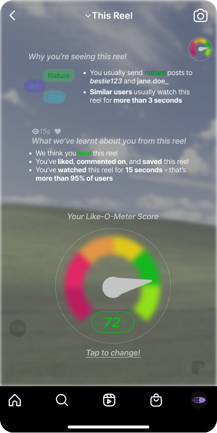
Tapping it expands to two views:
"This Reel" — why you're seeing this specific piece of content, what the algorithm has inferred from your engagement, and a speedometer-style score (−100 to 100) summarising your engagement signal. Users can manually adjust this score to correct algorithmic assumptions.
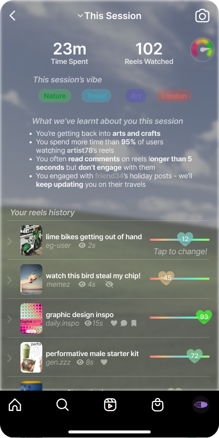
"This Session" — a concise summary of the current session: time spent, reels watched, inferred topic interests, and a reverse-chronological history of viewed reels with their engagement signals.
The session view was designed to support reflective awareness — making usage behaviour visible to support informed decision-making, not just per-reel transparency.
User testing
Methodology
We employed qualitative focus group methodology with four participants aged 20–24, recruited through convenience sampling. All reported regular Instagram usage with daily engagement ranging from approximately 5 minutes to 5 hours — a spread chosen deliberately to capture both light and heavy consumption patterns.
The session (~45 minutes) followed a structured procedure:
- Opening discussion of existing Reels experiences and mental models of recommendation
- Think-aloud observation of participants using the Like-O-Meter prototype
- Think-aloud evaluation of the Swipe Feedback prototype
- Comparative discussion and future-oriented speculative design session
Focus group was selected over individual interviews to enable socially constructed reflection on shared algorithmic experiences. Group discussions surface conflicts and co-constructed meanings that individual approaches miss (Morgan, 1996).
Quantitative usability data was collected using the System Usability Scale (SUS) to supplement qualitative findings.
Thematic analysis
Audio recordings were manually transcribed and analysed using reflexive thematic analysis following Braun and Clarke (2006). Analysis involved iterative familiarisation, inductive coding, theme development, and refinement.
96 initial codes were generated across the following clusters:
- Steering by algorithms
- Processes of invisible inference
- Effort barriers
- Cognitive load
- Behavioural awareness
- Precision and rating interpretation
These were refined into 4 higher-order themes reviewed against the full corpus for coherence and analytic validity.
Findings
SUS results
| Prototype | N | Mean | SD |
|---|---|---|---|
| Like-O-Meter | 4 | 3.10 | 0.08 |
| Swipe Feedback | 4 | 2.80 | 0.18 |
The higher mean for the Like-O-Meter suggests relatively stronger perceived usability and satisfaction. Given the small sample, findings are interpreted descriptively.
Theme 1: Perceived algorithmic agency and invisible infrastructure
Participants consistently described Instagram's algorithm as agentive and self-directing — shaping their feed through inferred signals rather than explicit intent. Early reflections revealed a vivid sense of opaque steering:
"The algorithm is always kind of steering you. Even if you try to keep on track, it always steers back."
The distinction between implicit and explicit signals emerged as a source of discomfort:
"I mean, liking and sharing are like two different things. If it's based on just my likes, it's fine. But if it takes on what I share, then I don't want my entire feed to change."
This aligns with prior research showing users are aware of opaque recommendation mechanisms without clear understanding of their operation (Eslami et al., 2015; Ananny & Crawford, 2018).
Theme 2: Cognitive load in numerical explainability
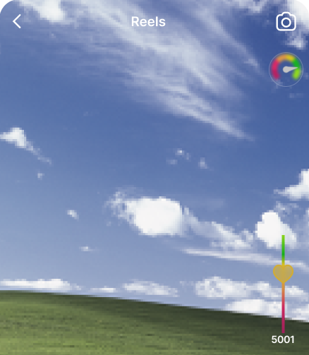
The Like-O-Meter's −100 to 100 score scale produced a key and actionable finding: numerical granularity created ambiguity rather than clarity.
"−100 to 100 is a huge range. I like it a little bit, or I like it 45% or 50%. How am I supposed to differentiate?"
The multi-step process of adjusting the score added further friction:
"This has got a lot of taps and a lot of cognitive load. It's great to give you control but at the same time, I feel like this will give you cognitive load."
"When they even have like one tap away from just clicking dislike, they are not even doing it because they are too lazy."
This finding directly informed a design iteration (see below).
Theme 3: Distributed control and interaction friction
Participants responded positively to the Swipe Feedback prototype precisely because it integrated correction into existing gesture flows without adding new interaction cost. The contrast with the Like-O-Meter's menu-based adjustment was stark — participants preferred control that was lightweight and contextually embedded over control that required deliberate navigation.
This points toward a preference for distributed control: explicit correction mechanisms embedded into fluid interaction, rather than surfaced through separate transparency screens.
Theme 4: Speculative design and platform accountability
The session's closing speculative design phase generated ideas that went beyond immediate usability toward broader questions of behavioural governance:
- Interruption mechanism after a set number of reels to promote scrolling self-awareness
- Longitudinal engagement reports across sessions
- Cumulative viewing metrics to support disengagement awareness
- A "Reels Wrapped" feature to revisit and reflect on past interactions
These suggestions reveal that users want not just per-session transparency but long-term accountability from AI-mediated platforms.
Design iteration
The cognitive load finding directly informed a second iteration of the Like-O-Meter score widget. The −100 to 100 numerical scale was replaced with a reaction slider — a sidebar UI integrated with iOS volume button affordances, using colour-banded abstraction rather than precise numerical values.
| Finding | Design response |
|---|---|
| Numerical scale created cognitive overload | Removed numerical values; implemented colour-banded abstraction |
| Menu-based adjustment reduced feedback use | Integrated single-gesture correction; reduced navigation depth |
| Risk of accidental corrective input | Introduced undo functionality |
Conceptual model
The project ultimately proposes a shift in how Instagram's recommendation infrastructure relates to its users:
| Current system | Proposed system |
|---|---|
| Implicit behavioural signals | Implicit signals + explicit feedback |
| → Opaque inference | → Visible inference representation |
| → Algorithmic steering | → Corrective interaction |
| → Passive consumption | → Distributed user control |
Reflections
Transparency without accessible affordances is insufficient. The Like-O-Meter demonstrated that making algorithmic inferences visible is valuable — but only if users can act on that visibility without cognitive cost. A transparency feature that introduces effort barriers will not be used, regardless of how useful the information is. The reaction slider iteration directly embodied this lesson.
Efficiency and agency are in fundamental tension in AI-mediated feeds. Neither prototype fully resolved this. The Swipe approach preserved fluidity but risked reinforcing opaque algorithmic steering through the same implicit gesture patterns. The Like-O-Meter strengthened perceived agency but introduced interactional burden. A blended approach — seamless swipe navigation with lightweight, contextual transparency cues — emerged as the most promising direction.
Explainability is constructed experientially, not just technically. Participants' sense of control was shaped as much by when and how information appeared as by the information itself. Opacity and intentionality shaped perceptions of algorithmic authority: when influence is implicit, it feels externalised; when visible and actionable, users experience greater ownership.
Effective focus groups need structure and hands-on interactivity. Sessions worked best when participants had something to react to — a working prototype or specific scenario — rather than abstract questions about algorithms. Think-aloud observation during actual use generated far richer data than direct questioning, and prompts were essential for drawing out less vocal participants.
If I were extending this work, I'd want to test the hybrid model longitudinally — does increased transparency change behaviour over time, or does novelty wear off? And I'd want to explore whether these designs work for users with lower digital literacy, who may lack the prior framework for understanding algorithmic inference at all.